Gallery
MaxQuantPlotter using python is given, that is deployed to subsequently generate
all following plots.Plotter creation
First, a plotter object has to be created to make the plots. Here, the MaxQuantPlotter is build from
the MSPInitializer class which creates and reads in the configuration file and initiates the
MQReader that loads the exemplary data set provided.
In [1]: import pandas as pd

In [2]: import os

In [3]: from mspypeline import load_example_dataset, MaxQuantPlotter

# load the data that is provided in a submodule
In [4]: init = load_example_dataset(configs={
   ...:     "has_techrep": True,
   ...:     "pathways": ["BIOCARTA_EGF_PATHWAY.txt", "HALLMARK_IL2_STAT5_SIGNALING.txt"],
   ...:     "go_terms": ["GO_APOPTOTIC_SIGNALING_PATHWAY.txt", "GO_INFLAMMATORY_RESPONSE.txt"]
   ...:     })
   ...:

In [5]: plotter = MaxQuantPlotter.from_MSPInitializer(init)

# create a second plotter without collapsed technical replicates
In [6]: init = load_example_dataset(configs={"has_techrep": False, "pathways":[]})

In [7]: plotter_with_tech_reps = MaxQuantPlotter.from_MSPInitializer(init)
define some helper functions and configurations
In [8]: on_rtd = os.environ.get('READTHEDOCS', False) == 'True'

In [9]: static_dir = "./_static" if on_rtd else "./source/_static"

In [10]: savefig_dir = "./savefig" if on_rtd else "./source/savefig"

In [11]: def select_fig(plts, idx):
   ....:     plt.figure(plts[idx][0].number)
   ....:
MaxQuant Report
create_report()The MaxQuant report was built with the intention to offer a broad insight into the different sources of information from a MaxQuant output tables. Besides the protein intensities (from the proteinGroups.txt file) which are the only source of data for all other parts of the analysis with the MaxQuant Plotter, further information about experimental and technical parameters of the experiment are taken into account.The MaxQuant report can function as a data quality control tool and outputs a multi-page pdf document composed of a variety of information and graphics.Make sure that all MaxQuant files which are used to create the report are provided.For overview of plots see analysis options
In [12]: plotter.create_report(static_dir);

# print("skipping report")
The resulting MaxQuant Report.
Normalization Plots
The helper function plot_all_normalizer_overview() is used to generate the same plot
multiple times with different normalizations methods of the base data.
Normalization overview
plot_normalization_overview_all_normalizers() by calling
plot_normalization_overview()The Normalization overview offers the opportunity to examine different aspects of the data in three distinct plots. For each normalization method provided an additional page is attached to the resulting pdf file starting with the raw or not normalized data. That way it is possible to get a better understanding of the effects of the normalization methods on the data, to inspect the different approaches and to find the best suitable normalization for the data.The normalization overview combines the plotsplot_kde()(see KDE example),plot_n_proteins_vs_quantile()(see proteins vs quantiles example) andplot_boxplot()(see boxplot example).To view adjustable parameters see “plot_normalization_overview_all_normalizers_settings:” in the Adjustable Options ConfigsFor overview of plots see analysis optionsFor exemplary plot see gallery
In [13]: plotter.plot_normalization_overview_all_normalizers("raw_log2", 0, save_path=static_dir);

# print("skipping norm overview")
Heatmap overview
plot_heatmap_overview_all_normalizers() by calling
plot_intensity_heatmap().Note
If the heatmap seems blurred try downloading it and using a different PDF viewer
In [14]: plotter.plot_heatmap_overview_all_normalizers("raw_log2", 0, vim=19.5, vmax=40, save_path=static_dir);

# print("skipping heatmap overview")
Outlier detection and comparison plots
Detection counts
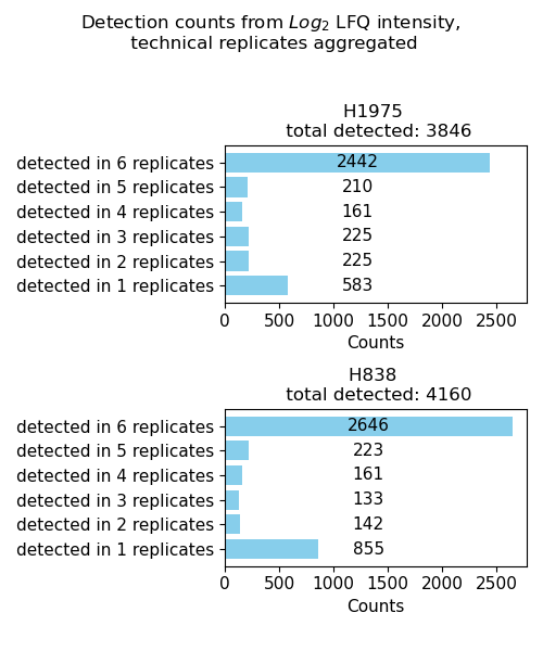
plot_detection_counts()Usesget_detection_counts_data()to count the number of intensity values > 0 per protein (number of samples that the protein is detected in) per group of the selected level.The data is plotted and saved usingsave_detection_counts_results()as a bar diagram showing how often proteins are detected in a number of samples/replicates for each group.To view adjustable parameters see “plot_detection_counts_settings:” in the Adjustable Options ConfigsFor overview of plots see analysis optionsFor exemplary plot see gallery
In [15]: plotter.plot_detection_counts("lfq_log2", 0, save_path=None);
Number of detected proteins
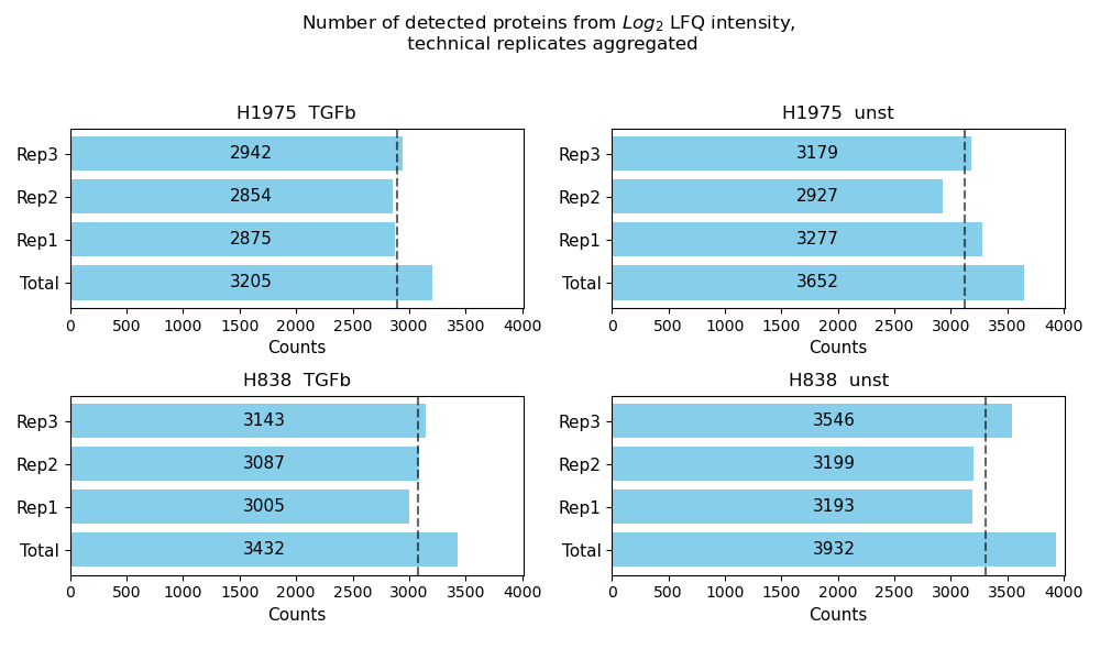
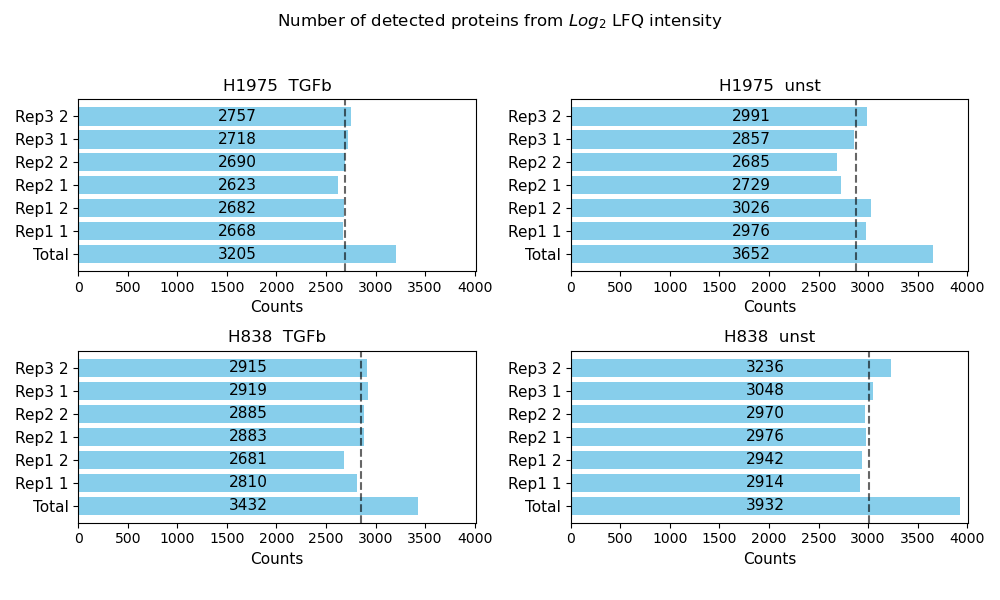
plot_detected_proteins_per_replicate()Usesget_detected_proteins_per_replicate_data()to count the number of protein intensity values greater than 0 (number of detected proteins) per sample of a group from the selected level.The data is plotted and saved usingsave_detected_proteins_per_replicate_results()as bar diagram showing the number of detected proteins per sample as well as the total number of detected proteins for each group of a selected level.The average number of detected proteins per group is indicated as gray dashed line.To view adjustable parameters see “plot_detected_proteins_per_replicate_settings:” in the Adjustable Options ConfigsFor overview of plots see analysis optionsFor exemplary plot see gallery
In [16]: plotter.plot_detected_proteins_per_replicate("lfq_log2", 1, save_path=None);

In [17]: plotter_with_tech_reps.plot_detected_proteins_per_replicate("lfq_log2", 1, save_path=None);
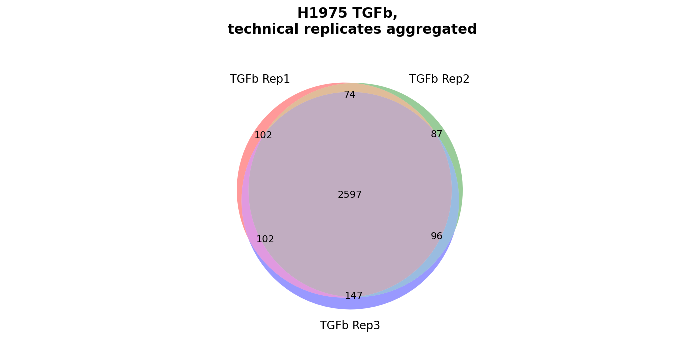
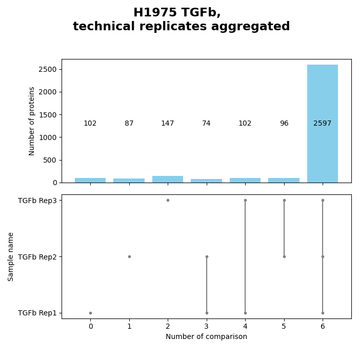
Venn diagrams
plot_venn_results()Venn diagrams conduce the graphical illustration of set theory. In themspypelineprotein counts (greater than zero) constitue the sets and set relationships indicate the number of proteins that are shared between two or more sets. Thereby the similarity of detected proteins of a set can be assessed. | The functionget_venn_data_per_key()is used to count the protein intensity values > 0 (number of detected proteins) for each replicate of a group from the selected level.The method creates and saves both a venn diagram usingsave_venn()and a bar-venn diagram usingsave_bar_venn()comparing the similarity of the replicates of each group from the selected level (based on protein counts). The ordinary venn diagram is quite intuitive, but it supports a maximum of three comparisons in themspypeline. The bar-venn diagram holds the advantage of allowing an unlimited number of comparison sets. These figures consists of two combined graphs, an upper bar diagram, tha indicates the number of unique or shared proteins of a set or overlapping sets. The lower graph indicates which set or sets are being compared, respectively, which protein count (upper graph) belongs to which comparison (lower graph).To view adjustable parameters see “plot_venn_results_settings:” in the Adjustable Options ConfigsFor overview of plots see analysis optionsFor exemplary plot see galleryNote
A venn diagram can compare a maximum of 3 samples.
A bar-venn diagram can compare more than 3 samples.
If a group of the selected level has more than 3 replicates, only the bar-venn diagram is created.
If the selected level has more than 6 groups no diagram is created
In [18]: plots = plotter.plot_venn_results("lfq_log2", 1, close_plots=None, save_path=None)

In [19]: select_fig(plots, 0);

In [20]: select_fig(plots, 1);
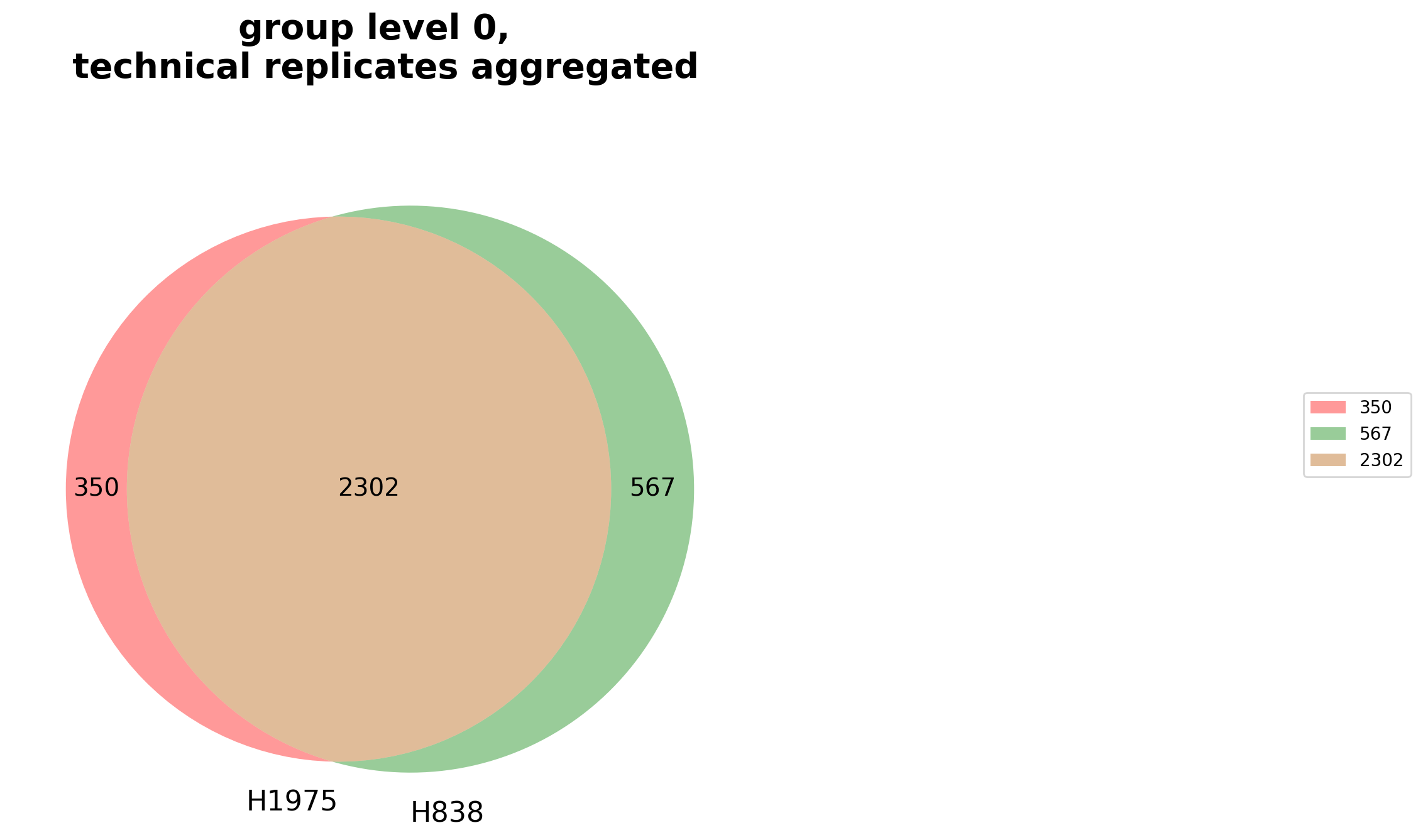
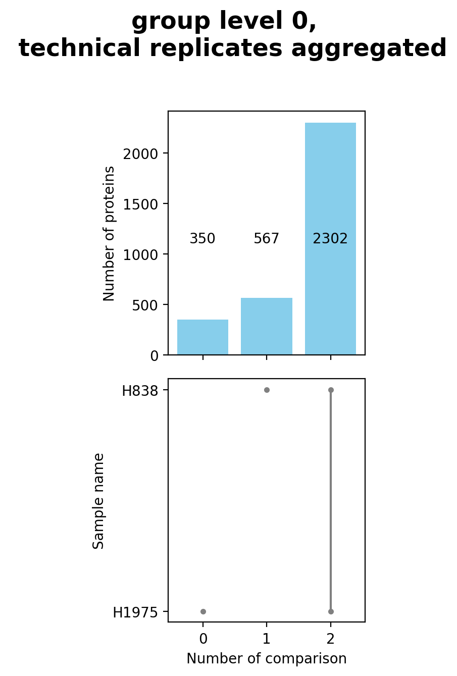
Group diagrams
plot_venn_groups()Venn diagrams conduce the graphical illustration of set theory. In themspypelineprotein counts (proteins with an intensity value > 0) constitute the sets and set relationships indicate the number of proteins that are shared between two or more sets. Thereby the similarity of detected proteins of a set can be assessed.The functionget_venn_group_data()is used to calculate which proteins can be compared between groups or are unique for a group of the selected level (see Thresholds and Comparisons) and then counts these proteins per group.The method then creates and saves both a venn diagram usingsave_venn()and a bar-venn diagram usingsave_bar_venn()comparing the similarity of the groups on the selected level (based on protein counts). The ordinary venn diagram is quite intuitive, but it supports a maximum of three comparisons in themspypeline. The bar-venn diagram holds the advantage of allowing an unlimited number of comparison sets. These figures consists of two combined graphs, an upper bar diagram, tha indicates the number of unique or shared proteins of a set or overlapping sets. The lower graph indicates which set or sets are being compared, respectively, which protein count (upper graph) belongs to which comparison (lower graph).To view adjustable parameters see “plot_venn_groups_settings:” in the Adjustable Options ConfigsFor overview of plots see analysis optionsFor exemplary plot see galleryNote
A venn diagram can compare a maximum of 3 samples.
A bar-venn diagram can compare more than 3 samples.
If the selected level has more than 3 groups, only the bar-venn diagram is created.
If the selected level has more than 6 groups no diagram is created
Note
To determine which proteins can be compared between the groups and which are unique for one group an internal threshold function is applied.
In [21]: plotter.plot_venn_groups("lfq_log2", 0, close_plots=None, save_path=savefig_dir, fig_format=".png");
Principal Component analysis (PCA) overview
plot_pca_overview()With the option to perform PCA, data can be studied for its variance and in doing so, parameters can be determined that have most strongly affected the variability between samples. The created PCA compares all components against each other (default = 2 components).PCA results are calculated usingget_pca_data()that gets protein intensities for all samples per group, processes data according to the given arguments, and then performs a dimensionality reduction (PCA) usingsklearn.decomposition.PCA. Multiple different analysis options can be chosen to generate a PCA (see: multiple option config).The results do not change in dependence on the chosen level, however, determining the level on which the data should be compared influences the coloring of the scatter elements. Each group of the selected level is colored differently. The data is plotted and saved usingsave_pca_results().To view adjustable parameters see “plot_pca_overview_settings:” in the Adjustable Options ConfigsFor overview of plots see analysis optionsFor exemplary plot see galleryplot_pca_overview_settings:
In [22]: plotter.plot_pca_overview("lfq_log2", 1, save_path=savefig_dir, fig_format=".png");

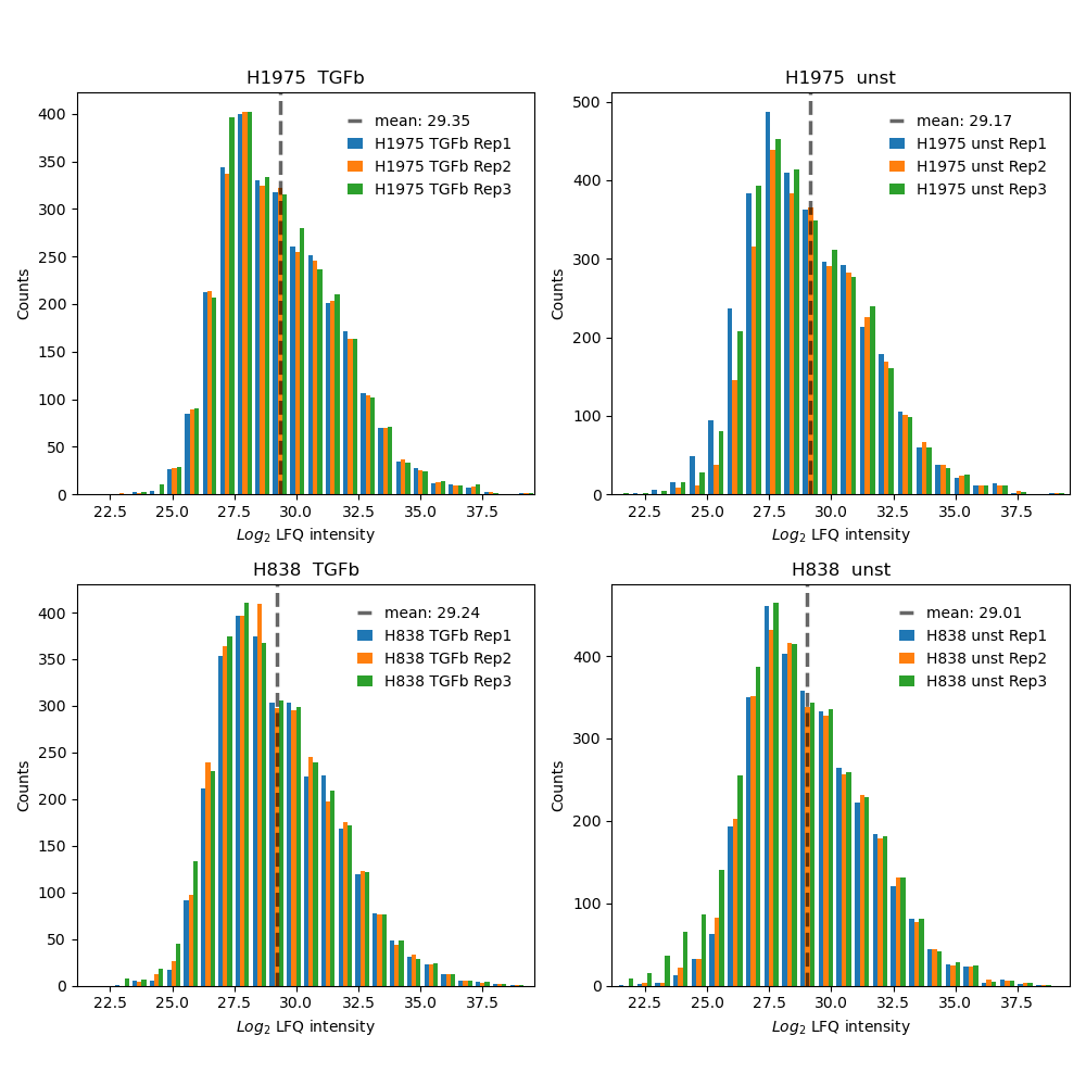
Intensity histogram
plot_intensity_histograms()Usesget_intensity_histograms_data()to get protein intensity values for each sample per group of the selected level.The intensity values of each sample are binned (default = 25) and the data of each sample from a group of the selected level is plotted and saved in one histogram usingsave_intensity_histogram_results().If the parameter “show_mean” is set to True in the configs the mean intensity of the plotted samples of a group is shown as gray dashed line.To view adjustable parameters see “plot_intensity_histograms_settings:” in the Adjustable Options ConfigsFor overview of plots see analysis optionsFor exemplary plot see gallery
In [23]: plotter.plot_intensity_histograms("lfq_log2", 1, save_path=None);
Relative standard deviation (std)
plot_relative_std()Illustrates the relative standard deviation of the proteins between samples of a group which can help to understand how much fluctuation of the measured intensities is present between the replicates. Low deviation indicates that measured intensities are stable over multiple samples.For each group of the selected level one plot is created.The method appliesget_relative_std_data()to calculate which proteins of a group can be used for the analysis (see Thresholds and Comparisons) and to filter out proteins below the threshold. Then,save_relative_std_results()is used to calculate the relative standard deviation and plot and save the data.Lines drawn in different shades of blue indicate arbitrary chosen thresholds of 10%, 20% and 30% of the relative std and the number of proteins with a relative std below these values.To view adjustable parameters see “plot_relative_std_settings:” in the Adjustable Options ConfigsFor overview of plots see analysis optionsFor exemplary plot see galleryNote
To determine which proteins can be compared between the two samples an internal threshold function is applied.
In [24]: plotter.plot_relative_std("lfq_log2", 0, save_path=None);

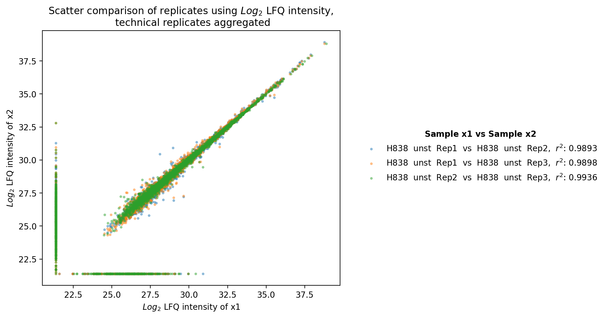
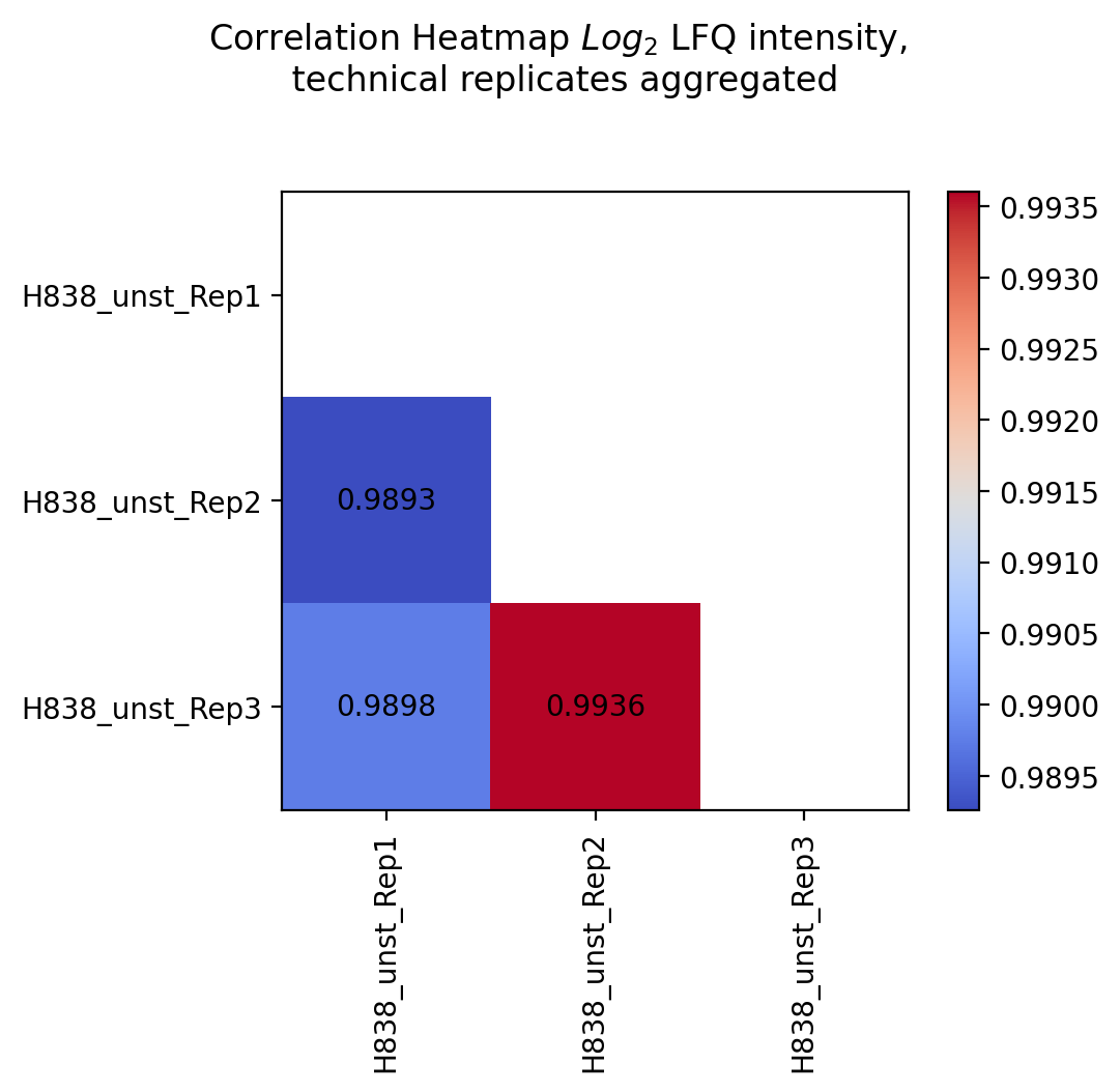
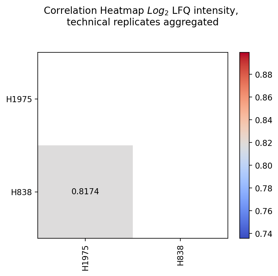
Scatter replicates
plot_scatter_replicates()Usesget_scatter_replicates_data()to retrieve protein intensity values for each sample of a selected group.For all samples/replicates per group of the selected level, pairwise comparisons of the protein intensities are plotted and their Pearson’s correlation coefficient r^2 is calculated.Unique proteins per replicate are shown at the bottom and right side of the graph (replacement of NA values by min value of data set).The calculated Pearson’s correlation coefficient r^2 is additionally visualized in form of a correlation heatmap.For a group with more than 2 replicates, each pairwise comparison of the replicates is calculated and plotted together in one graph. For every group of the selected level one scatter plot and one correlation heatmap is created and saved usingsave_scatter_replicates_results().To view adjustable parameters see “plot_scatter_replicates_settings:” in the Adjustable Options ConfigsFor overview of plots see analysis optionsFor exemplary plot see gallery
In [25]: plotter.plot_scatter_replicates("lfq_log2", 1, save_path=savefig_dir, fig_format=".png");
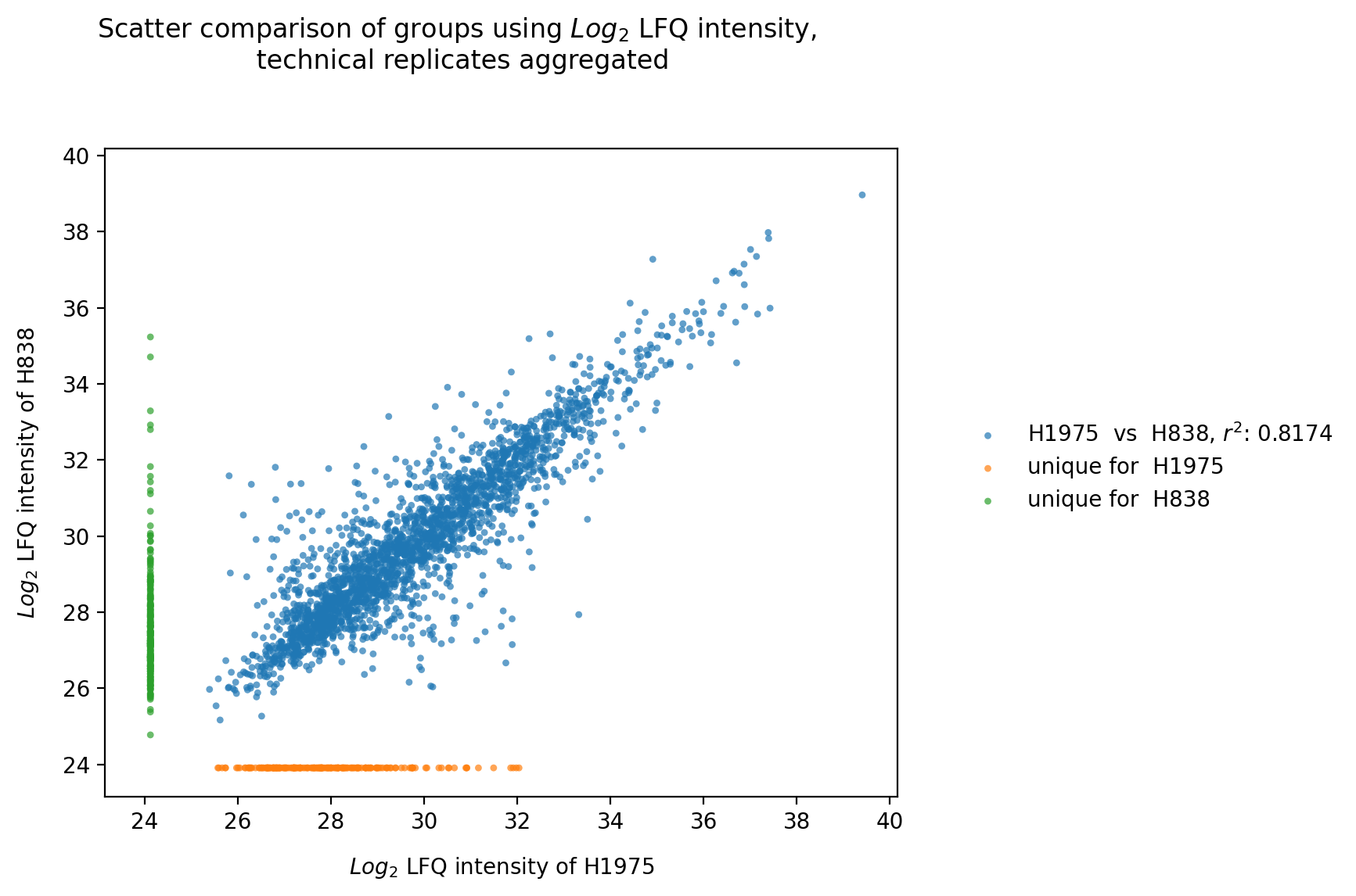
Experiment comparison
plot_experiment_comparison()To generate the experiment comparison plot, the functionget_experiment_comparison_data()is used to retrieve protein intensity values for all samples of a given group and to classify those proteins that can be compared between groups and those that are unique for each group (see Thresholds and Comparisons). Then the the mean intensity of these proteins is calculated.For all groups of the selected level, pairwise comparisons of the protein intensities are plotted and their Pearson’s correlation coefficient r^2 is calculated.Unique proteins per group are shown at the bottom and right side of the graph (substitution of missing values by the minimum value of the data set).The calculated Pearson’s correlation coefficient r^2 is additionally visualized in form of a correlation heatmap.For every pairwise comparison of the groups from the selected level, one scatter plot is created and the results of all pairwise comparisons together are visualized in one combined correlation heatmap usingsave_scatter_replicates_results().To view adjustable parameters see “plot_experiment_comparison_settings:” in the Adjustable Options ConfigsFor overview of plots see analysis optionsFor exemplary plot see galleryNote
To determine which proteins can be compared between the two groups and which are unique for one group an internal threshold function is applied.
In [26]: plotter.plot_experiment_comparison("lfq_log2", 0, save_path=savefig_dir, fig_format=".png");
Rank
plot_rank()In the rank plot all proteins are sorted by intensity value usingget_rank_data()and plotted against their rank. For every group of the selected level one plot is created and saved bysave_rank_results(), averaging the protein intensities of the replicates of a group.The highest intensity accounts for rank 0, the lowest intensity for the number of proteins - 1 whereby proteins with missing values are neglected. The median intensity of all proteins is given in the legend.Pathway analysis protein lists can be applied to the rank plot to provide information about the median intensity or rank of pathways of interest. If a protein is part of a selected pathway it is presented in color and the median rank of all proteins of a given pathway is indicated. Multiple pathways can be selected and and are consequently represented in the same graph as distinct groups.To view adjustable parameters see “plot_rank_settings:” in the Adjustable Options ConfigsFor overview of plots see analysis optionsFor exemplary plot see gallery
In [27]: plotter.plot_rank("lfq_log2", 0, save_path=savefig_dir, fig_format=".png");
Statistical inference plots
Pathway analysis
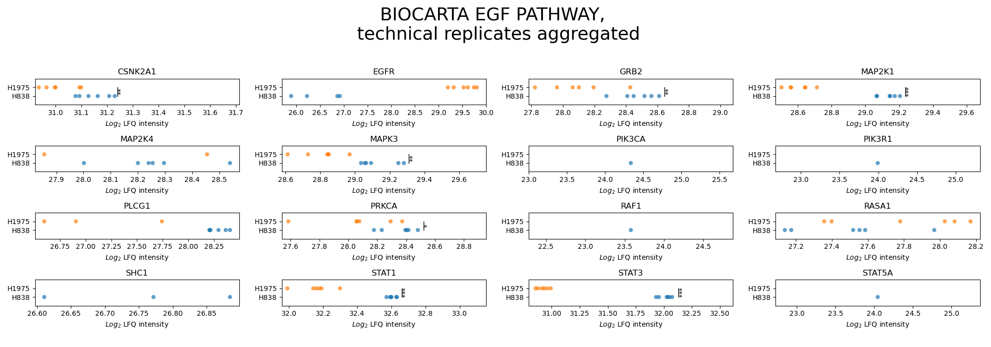
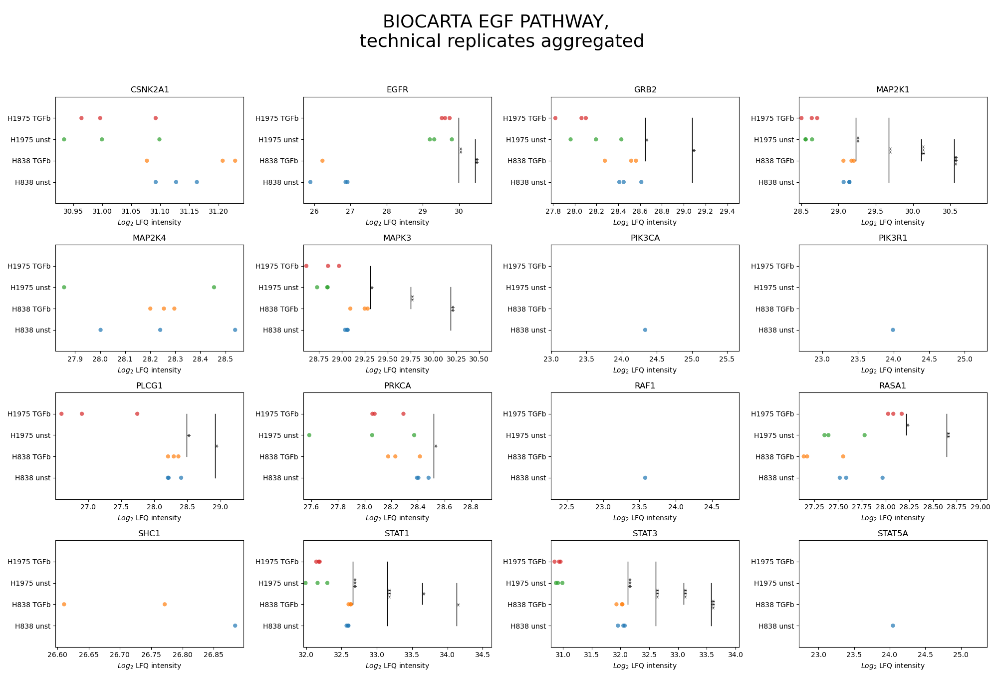
plot_pathway_analysis()In the pathway analysis, for each protein of a desired pathway a subplot is created displaying the intensities of the protein for all groups of the selected level.First,get_pathway_analysis_data()is used to filter out all proteins of the desired pathways for all samples per group of the selected level. The function then determines which of those proteins can be compared between samples (see Thresholds and Comparisons) and significances of these protein intensities are calculated for each pairwise comparison between groups with an independent t-test. P value thresholds are set to the following: * is p < 0.05, ** is p < 0.005, and *** is p < 0.0005. For every selected pathway, two figures are created and saved usingsave_pathway_analysis_results(), one displaying the significances and the other not displaying them.For a group of multiple samples, the protein intensity is plotted for each sample (single scatter dot) which are jointly presented in uniform coloring.To view adjustable parameters see “plot_pathway_analysis_settings:” in the Adjustable Options ConfigsFor overview of plots see analysis optionsFor exemplary plot see galleryNote
To determine which proteins can be compared between two groups an internal threshold function is applied.
In [28]: plots_level0 = plotter.plot_pathway_analysis("lfq_log2", 0, close_plots=None, save_path=None)

In [29]: plots_level1 = plotter.plot_pathway_analysis("lfq_log2", 1, close_plots=None, save_path=None)

In [30]: select_fig(plots_level0, 0);

In [31]: select_fig(plots_level1, 0);
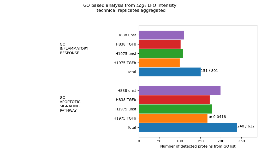
Go analysis
plot_go_analysis()In the GO analysis, an enrichment analysis is performed for each selected GO Term file (based on protein counts = proteins with intensity value > 0). For this analysisget_go_analysis_data()is used to calculate the number of detected proteins from a GO term that are found in each group of the selected level. The data is illustrated as the length of the corresponding bar. P values shown at the end of a bar indicate the calculated significance. Samples referred to as “Total” represent the complete data set and numbers at the top of the graph accord to the count of detected proteins in all samples over the total number of proteins in the GO term. The data of all chosen pathways is plotted and saved in one graph usingsave_go_analysis_results()For p-value calculation, first, for each GO term, a list “pathway_genes” is created by taking the intersection of the proteins from the GO list and the total detected proteins.Secondly, a list of “non_pathway_genes” is created which comprises total detected proteins but proteins in “pathway_genes”.Third, a list of “experiment_genes” and “non_experiment_genes” is created in a similar fashion where an experiment references to a sample/group of samples of the data set.Lastly, a one-tailed fisher exact test is calculated to retrieve statistical significances based on the following contingency table:
in pathway
not in pathway
in experiment
experiment_genes & pathway_genes
experiment_genes & not_pathway_genes
not in experiment
not_experiment_genes & pathway_genes
not_experiment_genes & not_pathway_genes
The resulting p-value is thus, also dependent on the overall protein count of the sample/group of samples. A sample is considered significant if the p value is > 0.05.To view adjustable parameters see “plot_go_analysis_settings:” in the Adjustable Options ConfigsFor overview of plots see analysis optionsFor exemplary plot see gallery
In [32]: plotter.plot_go_analysis("lfq_log2", 1, save_path=None);
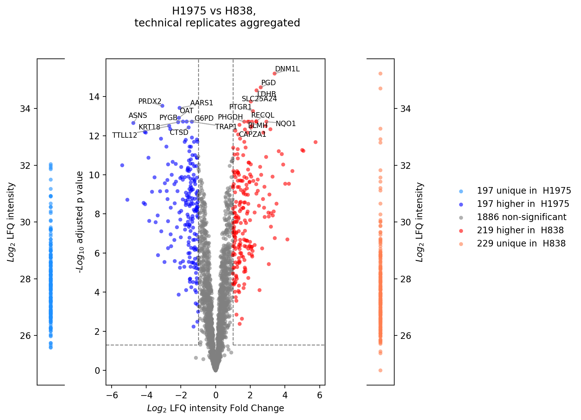
Volcano plot (R)
plot_r_volcano()get_r_volcano_data() is applied.Note
should be used with log2 intensities
minimum of 3 samples per group required
Note
To determine which proteins can be compared between the two groups and which are unique for one group an internal threshold function is applied.
In [33]: print("pass")
pass

# plotter_with_tech_reps.plot_r_volcano("lfq_log2", 0, sample1="H1975", sample2="H838", adj_pval=False, save_path=savefig_dir, fig_format=".png");
Additionally via python
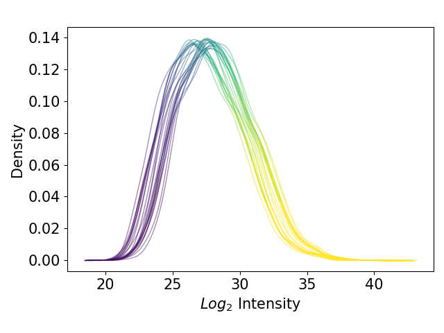
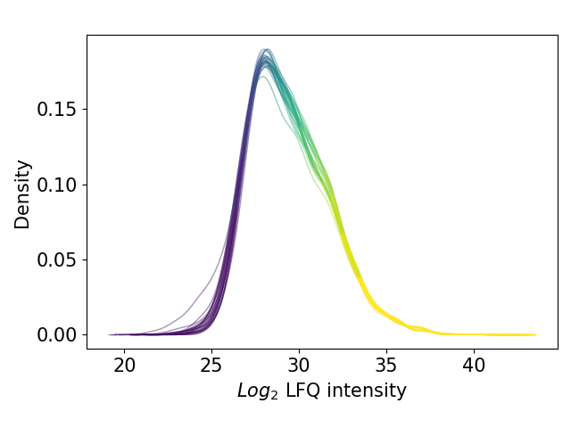
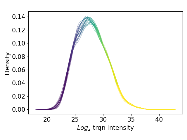
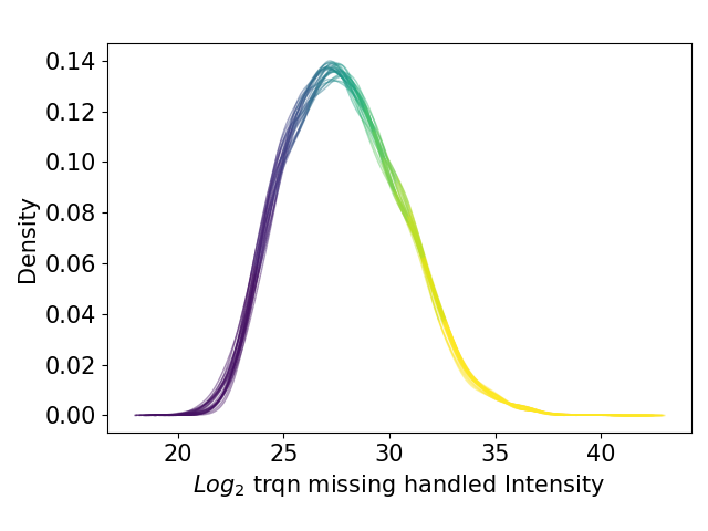
Kernel density estimate plot
plot_kde()In the kernel density estimate (KDE) plot, one density graph per sample is plotted indicating the intensity (derived fromget_kde_data()) on the x axis and the density on the y axis. The data is plotted and saved usingsave_kde_results().These plots should be presented on a log2 scale.The KDE is well suited to study the influence of different normalization methods and protein intensities on the data which is why it is part if the Normalization overview.For overview of plots see analysis optionsFor exemplary plot see gallery
In [34]: plotter.add_normalized_option("raw", plotter.normalizers["trqn"], "trqn")

In [35]: plotter.add_normalized_option("raw", plotter.normalizers["trqn_missing_handled"], "trqn_missing_handled")

In [36]: plotter.plot_kde("raw_log2", 3, save_path=None);

In [37]: plotter.plot_kde("lfq_log2", 3, save_path=None);

In [38]: plotter.plot_kde("raw_trqn_log2", 3, save_path=None);

In [39]: plotter.plot_kde("raw_trqn_missing_handled_log2", 3, save_path=None);
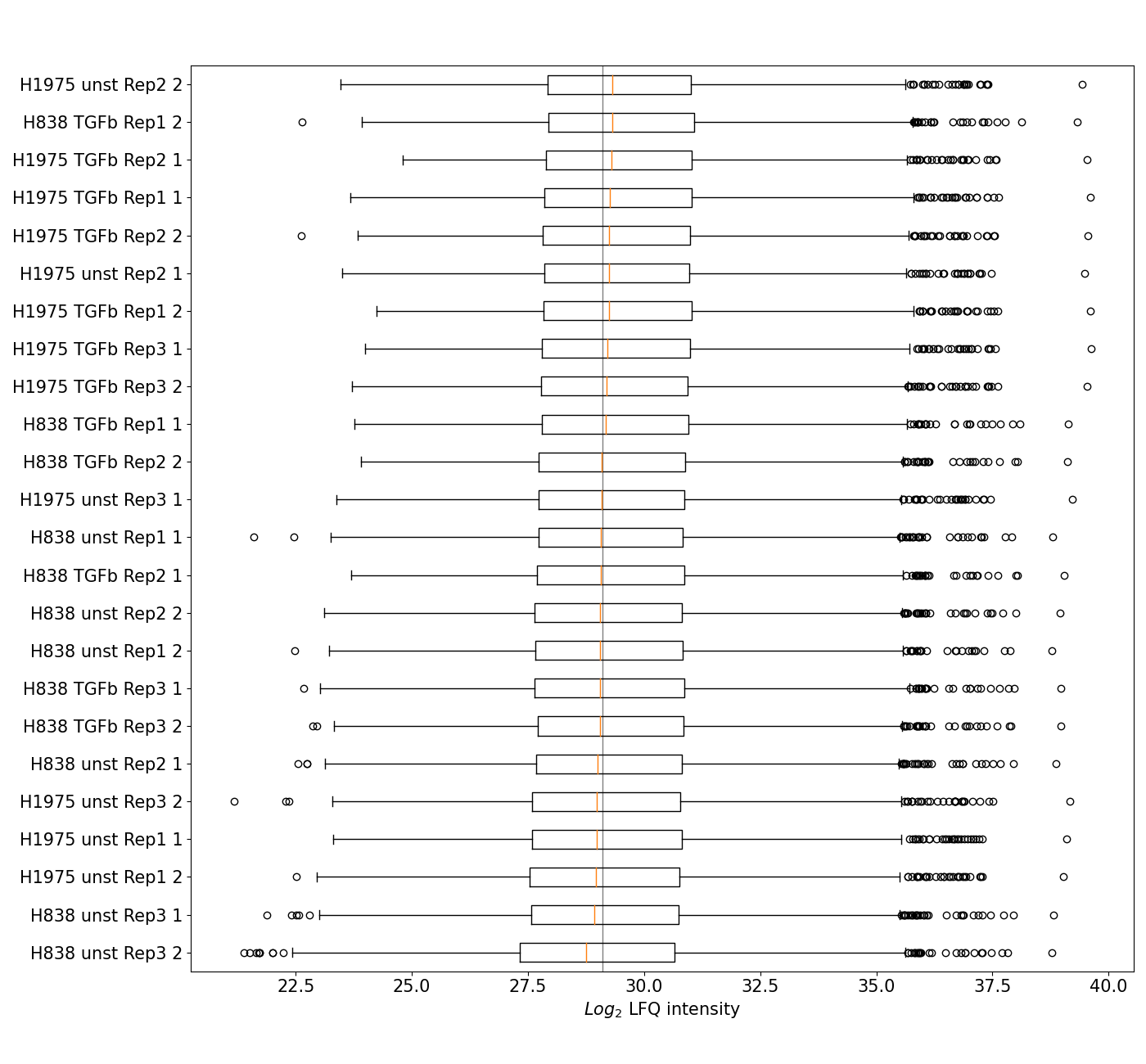
Boxplot
plot_boxplot()A standard boxplot displaying the five quantile distribution per group of the selected level and ranking the groups by median intensity from the bottom of the graph to the top.The plot is created by applyingget_pca_data()to get protein intensities for all samples per group of the selected level and the sort samples by their median intensity. Data is plotted and saved usingsave_boxplot_results()The boxplot is part of the Normalization overview.For overview of plots see analysis optionsFor exemplary plot see gallery
In [40]: plotter.plot_boxplot("lfq_log2", 3, save_path=None);
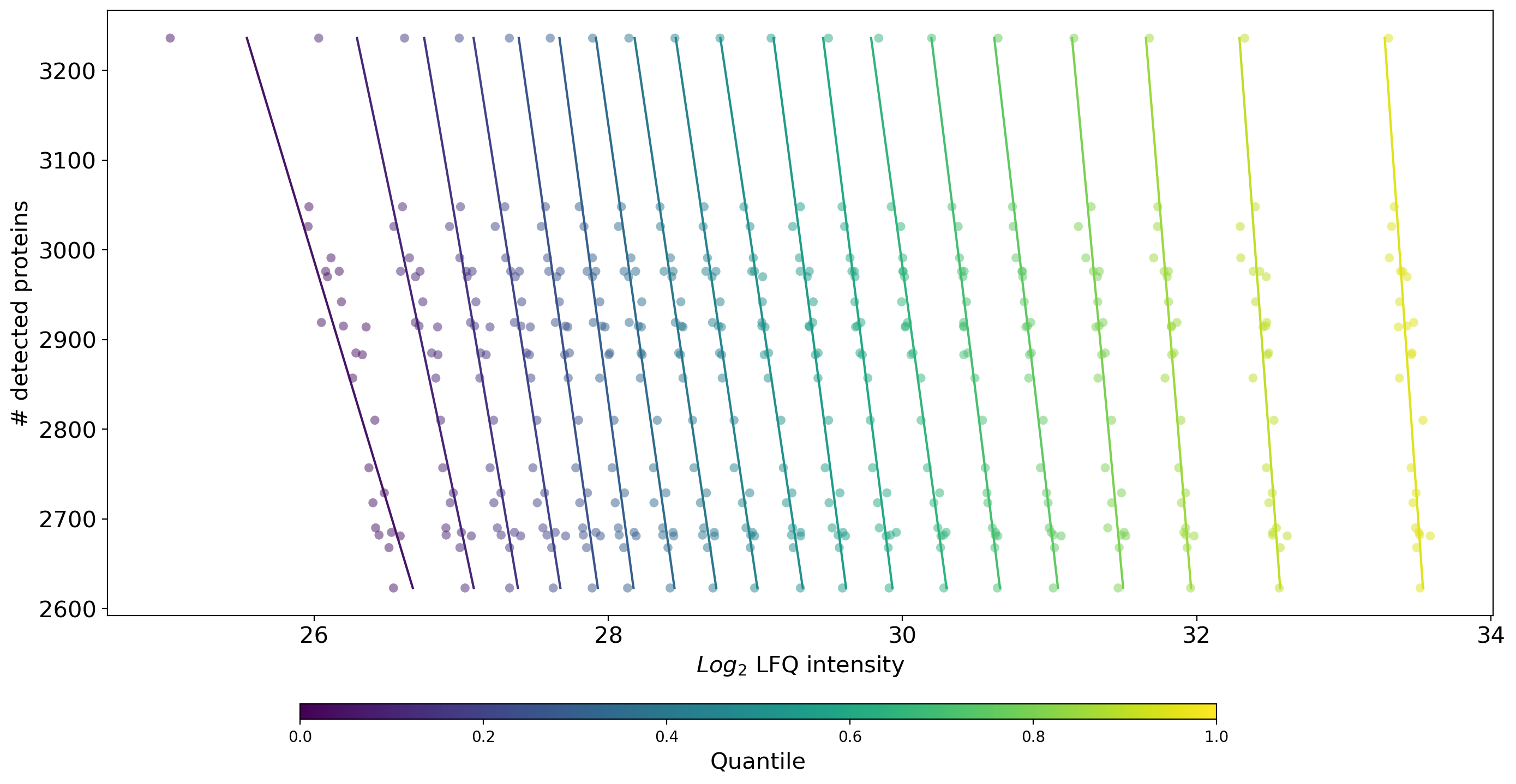
Number of Proteins vs Quantiles
plot_n_proteins_vs_quantile()Plots the quantile protein intensities against the number of identified proteins per sample.get_n_protein_vs_quantile_data()is used to get protein intensities for all samples per group and subsequently count the number of intensity values > 0 (total number of detected proteins) and the quantiles per sample. The data is visualized and saved bysave_n_proteins_vs_quantile_results().Samples are indicated as a horizontal line of scatter dots where the color anf x position of a dot indicate the intensity value of the respective quantile. The y position of the dots of a sample point to the total number of detected proteins in that sample.Solid, rather vertical lines indicate a linear fit of each quantile for all the samples.This plot is part of the Normalization overview.For overview of plots see analysis optionsFor exemplary plot see gallery
In [41]: plotter.plot_n_proteins_vs_quantile("lfq_log2", 3, save_path=savefig_dir, fig_format=".png");
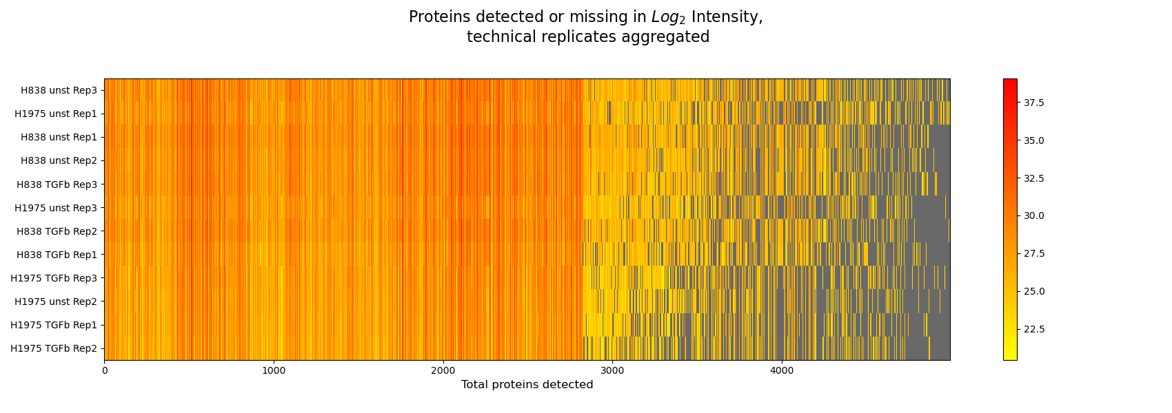
Intensity Heatmap
plot_intensity_heatmap()The intensity heatmap demonstrates protein intensities (derived fromget_intensity_heatmap_data()), where samples are given in rows on the y axis and proteins on the x axis. Missing values are colored in gray. The data is plotted and saved usingsave_intensities_heatmap_result().The heatmap can be used to spot patterns in the different normalization methods and to understand how different intensity types affect the data.The Heatmap overview is created from a series of intensity heatmap plots.For overview of plots see analysis optionsFor exemplary plot see gallery
In [42]: plotter.plot_intensity_heatmap("lfq_log2", 2, sort_index_by_missing=True, sort_columns_by_missing=True, save_path=None);

In [43]: plotter.plot_intensity_heatmap("raw_log2", 2, sort_index_by_missing=True, sort_columns_by_missing=True, save_path=None);